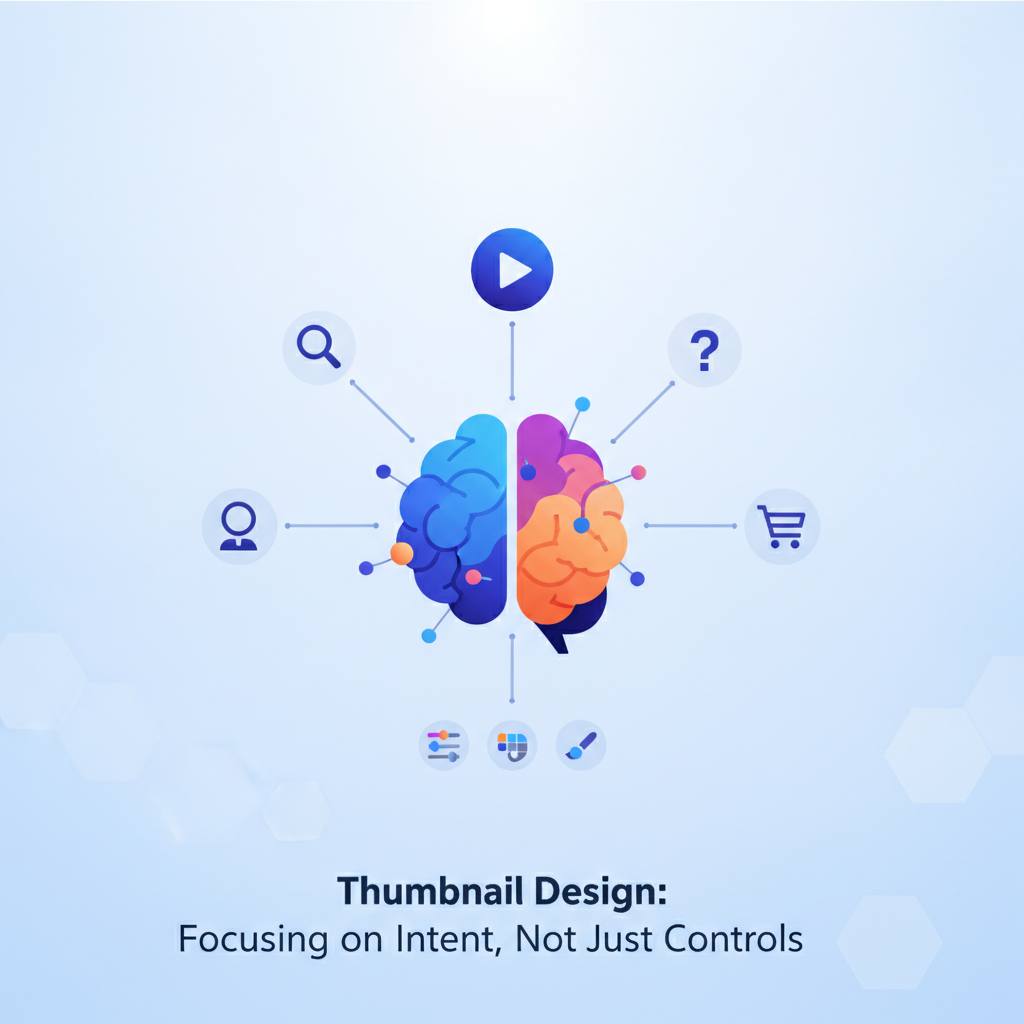
A new tech insight suggests that designing thumbnail annotation systems should prioritize the user's 'intent' behind the text and arrows, rather than just providing generic visual controls. This approach simplifies the review process and leads to more effective designs.
Have you ever struggled to design a compelling thumbnail for your project or video, only to receive vague feedback like «make it pop»? The good news is, the challenge might not be your creative skills, but how the annotation tools themselves are designed. A fresh perspective from web development suggests that thumbnail annotation systems — the text and arrows we use to highlight key ideas — should focus on their true «intent,» not merely offering buttons for control.
Think about it: when you use a tool to change a font's color or size, you might not be expressing the *reason* for that alteration. This leads to broad review comments like «make it pop» or «change it to look better,» which are incredibly difficult to implement consistently or test effectively. Instead, the proposal advocates treating text and arrows as annotations with a clear «purpose.» Text should explain a short idea, and an arrow should mark a specific visual target. Both need a clear reason for their existence that goes beyond just aesthetics.
At the interface level, a text annotation needs a message and a readability condition. An arrow annotation requires a target and a clear direction. The true value isn't in the technical field list itself, but in the specific questions it enables during review. So, instead of a reviewer asking, «Does the red arrow look exciting enough?», they can ask, «What is this arrow pointing at?». This fundamental shift in questioning can make a world of difference.
The public YouTube Thumbnail Font Generator serves as an excellent example of why text needs several separate controls. Weight, size, letter spacing, fill color, outline, shadow, and background transparency all affect different aspects of a phrase independently. Bundling these into one single «boldness» slider would make comparisons vague and ineffective. If a team changes the typeface, size, outline, and copy all at once, the final result might look better, but the team learns very little about *why* it improved.
The key takeaway is to use a controlled review and adjustment loop: lock the main element, compare two distinct options (like two font weights), then lock in the better one. This ensures you learn with each change, rather than repeatedly starting from the same point of uncertainty.
Think about it: when you use a tool to change a font's color or size, you might not be expressing the *reason* for that alteration. This leads to broad review comments like «make it pop» or «change it to look better,» which are incredibly difficult to implement consistently or test effectively. Instead, the proposal advocates treating text and arrows as annotations with a clear «purpose.» Text should explain a short idea, and an arrow should mark a specific visual target. Both need a clear reason for their existence that goes beyond just aesthetics.
At the interface level, a text annotation needs a message and a readability condition. An arrow annotation requires a target and a clear direction. The true value isn't in the technical field list itself, but in the specific questions it enables during review. So, instead of a reviewer asking, «Does the red arrow look exciting enough?», they can ask, «What is this arrow pointing at?». This fundamental shift in questioning can make a world of difference.
The public YouTube Thumbnail Font Generator serves as an excellent example of why text needs several separate controls. Weight, size, letter spacing, fill color, outline, shadow, and background transparency all affect different aspects of a phrase independently. Bundling these into one single «boldness» slider would make comparisons vague and ineffective. If a team changes the typeface, size, outline, and copy all at once, the final result might look better, but the team learns very little about *why* it improved.
The key takeaway is to use a controlled review and adjustment loop: lock the main element, compare two distinct options (like two font weights), then lock in the better one. This ensures you learn with each change, rather than repeatedly starting from the same point of uncertainty.